

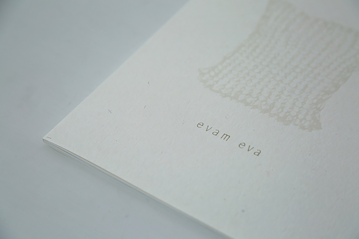
時の流れとともに、その時の心の在りようをコレクションテーマに掲げて、evam eva の服はつくり続けられています。そのインスピレーションは、日々の暮らしの中から生まれるもの。ふと目にした何気ない日常の景色、誰かの言葉やいつかの遠い記憶。それらを繋ぎ合わせ、素材や色、シルエット、ディテールに映しとり、デザインが生まれます。そして、心に思い漂う世界観を表現するためのコレクションカタログ。今回のコラムでは、evam eva のカタログ制作に携わっていただいている方々にお話を伺いながら、カタログが出来上がるまでをご紹介いたします。
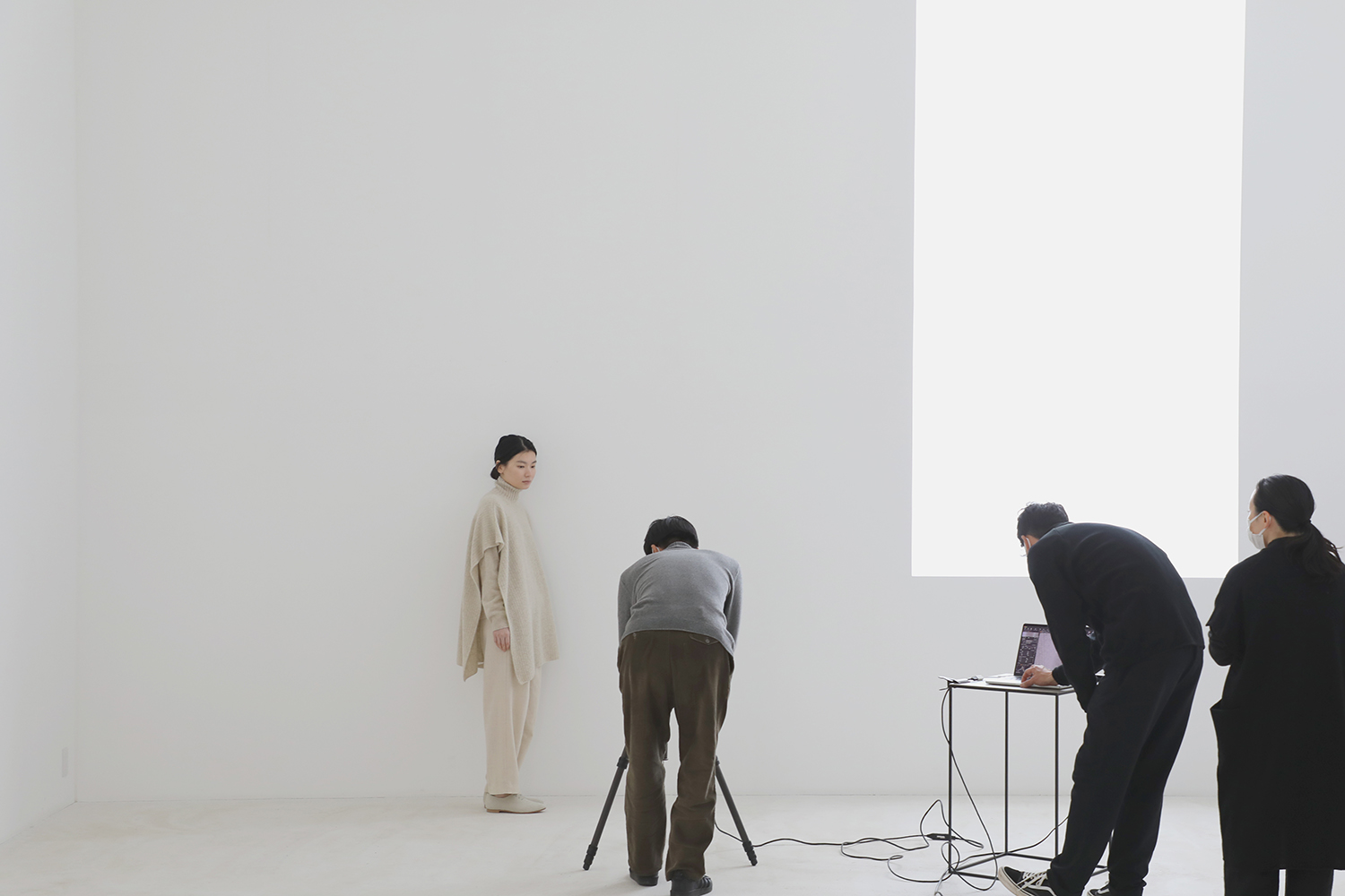

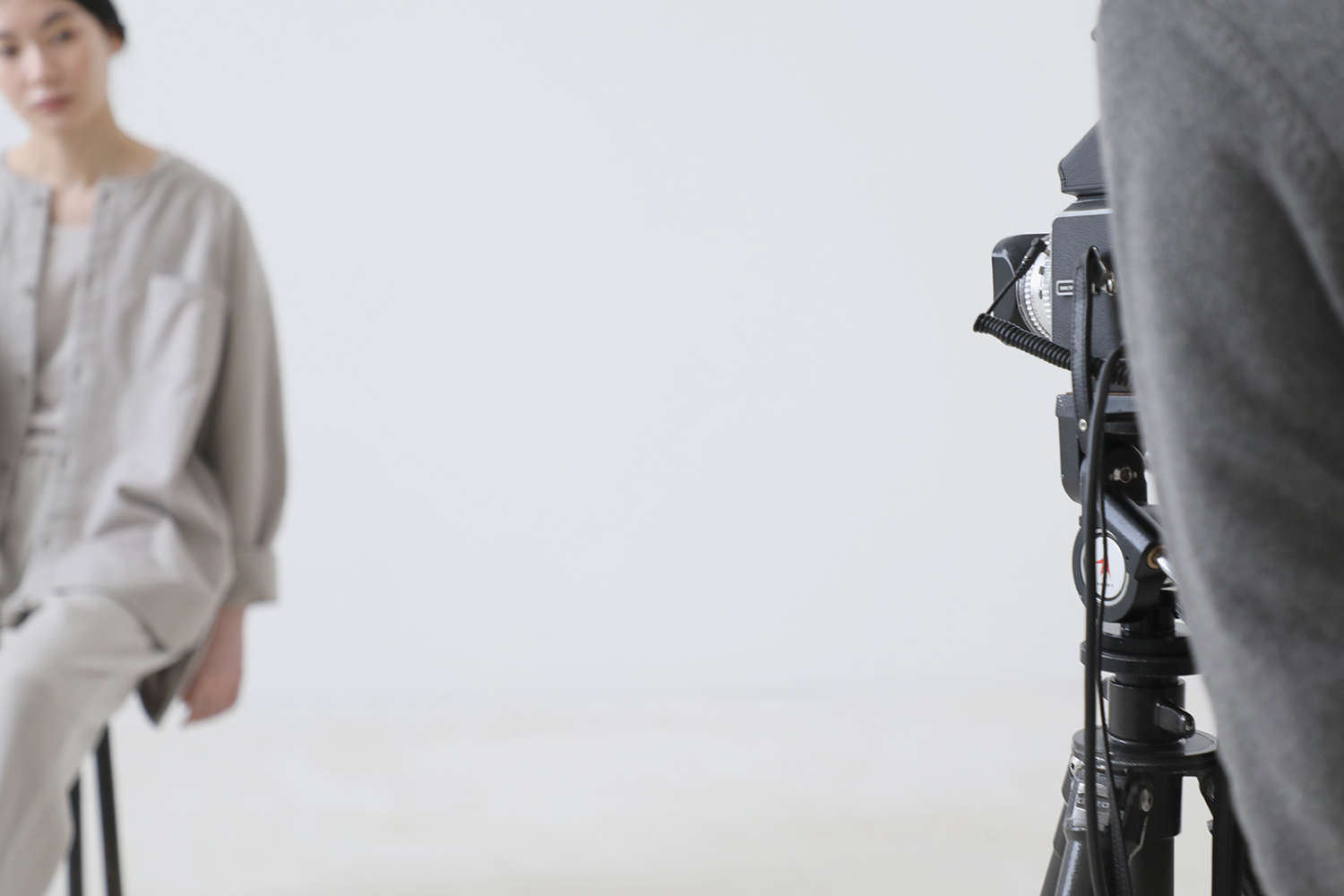
一番の寒波が訪れた1月の終わり、evam eva yamanashi にて 2023年秋冬コレクションカタログの撮影が行われました。
季節が移ろう頃にお届けするシーズンカタログ。心高まる四季の節目に寄り添うように、新鮮でありながらも、evam eva らしい着こなしや色合わせを提案します。2023年秋冬コレクションは、柄、質感ともにより風合い豊かな素材が揃い、季節の深まりとともに重ね合わせを愉しめる装いとなっています。
evam eva が紡ぎだす世界観には素材選びと同じくらい大切な色。自然にあるうつくしい色合いやその時の心情、在りたい姿を想像しながらシーズンカラーを決め、色を創りだします。同じ色に染めたとしても、素材が変わると色合いには微かに違いが生まれます。その色の揺らぎが服となり纏ったときに陰影が生まれ、自然な色味と風合いをつくりだします。
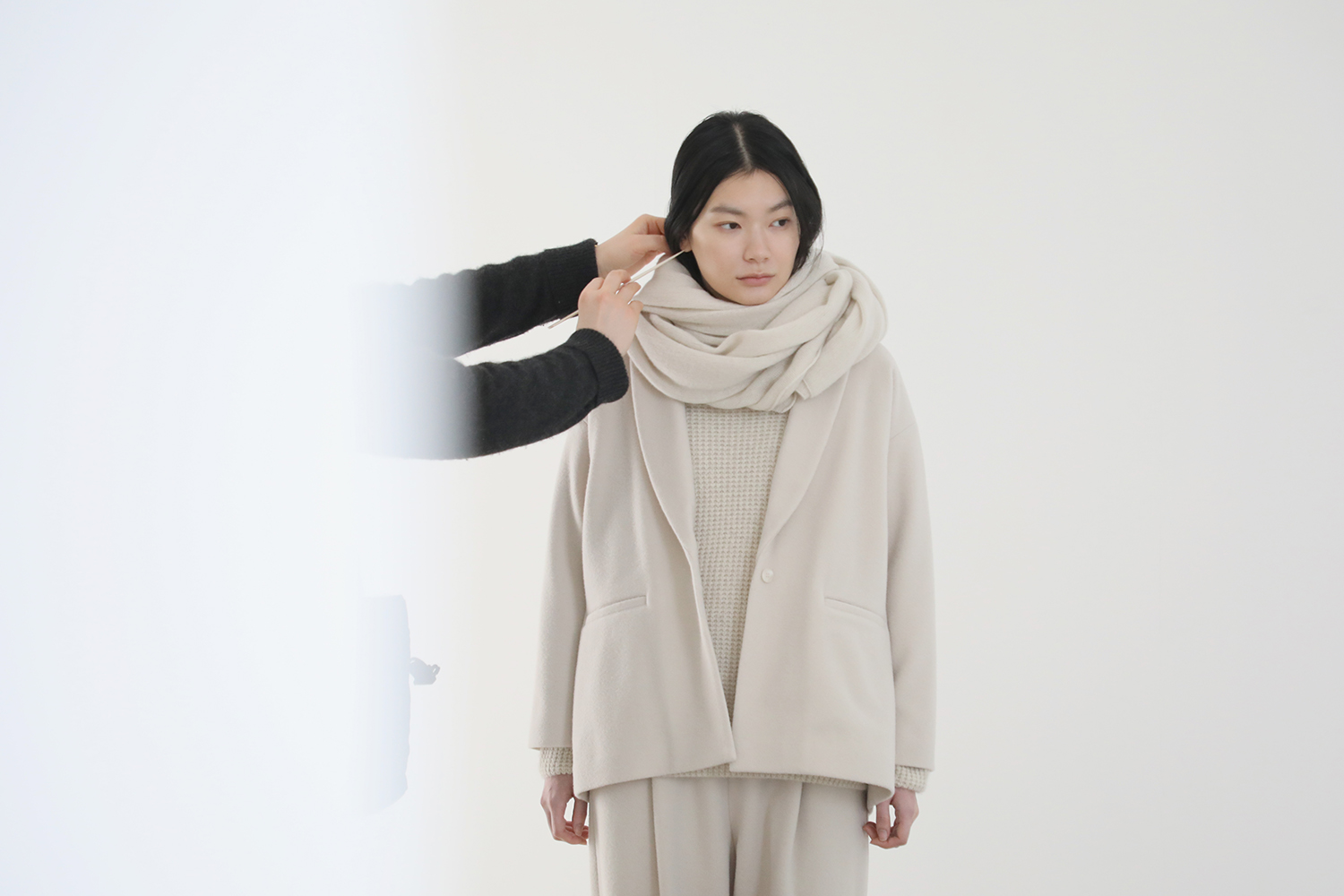
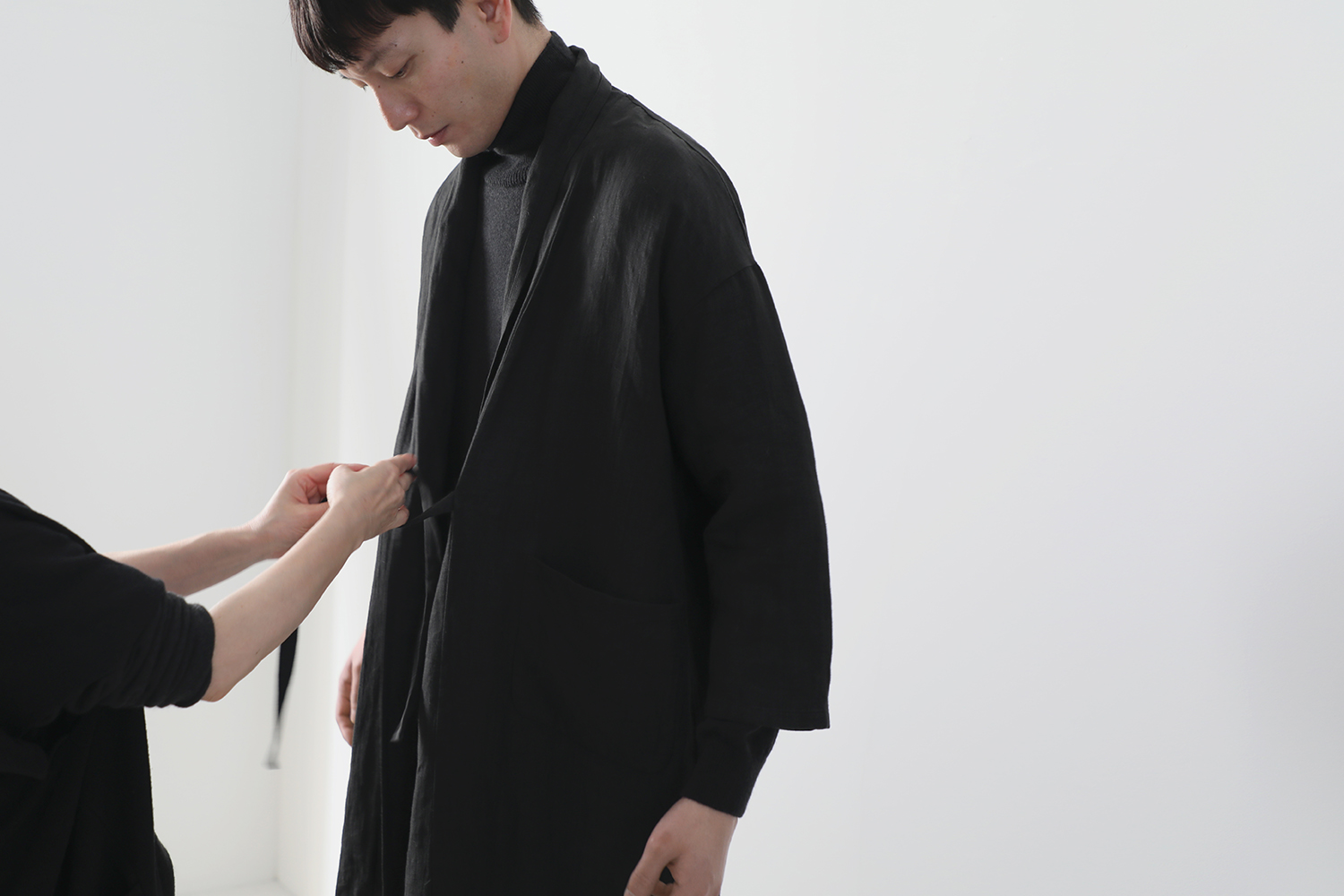
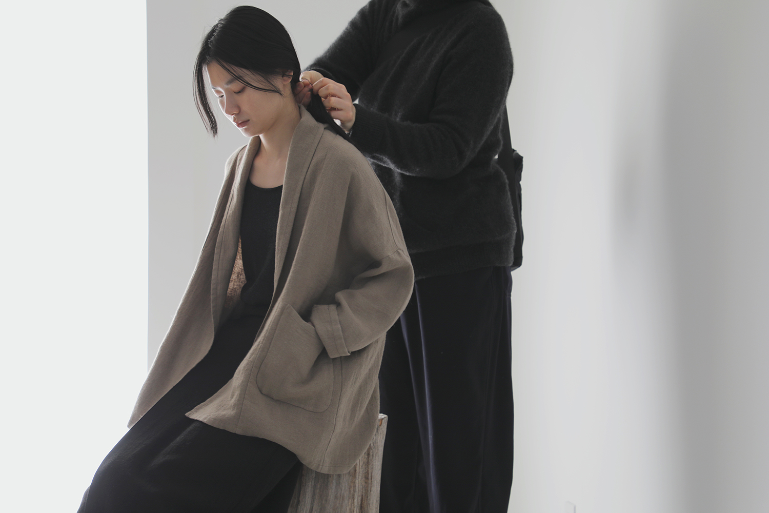
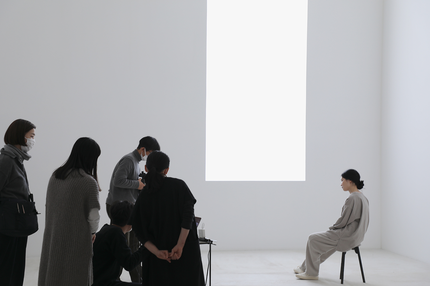
襟、袖、裾のシルエットやドレープの形、色を重ね合わせるバランスなど、細かなニュアンスにevam eva らしさが宿るよう、撮影時には着る人の身体やポージングに合わせて細部を整えていきます。
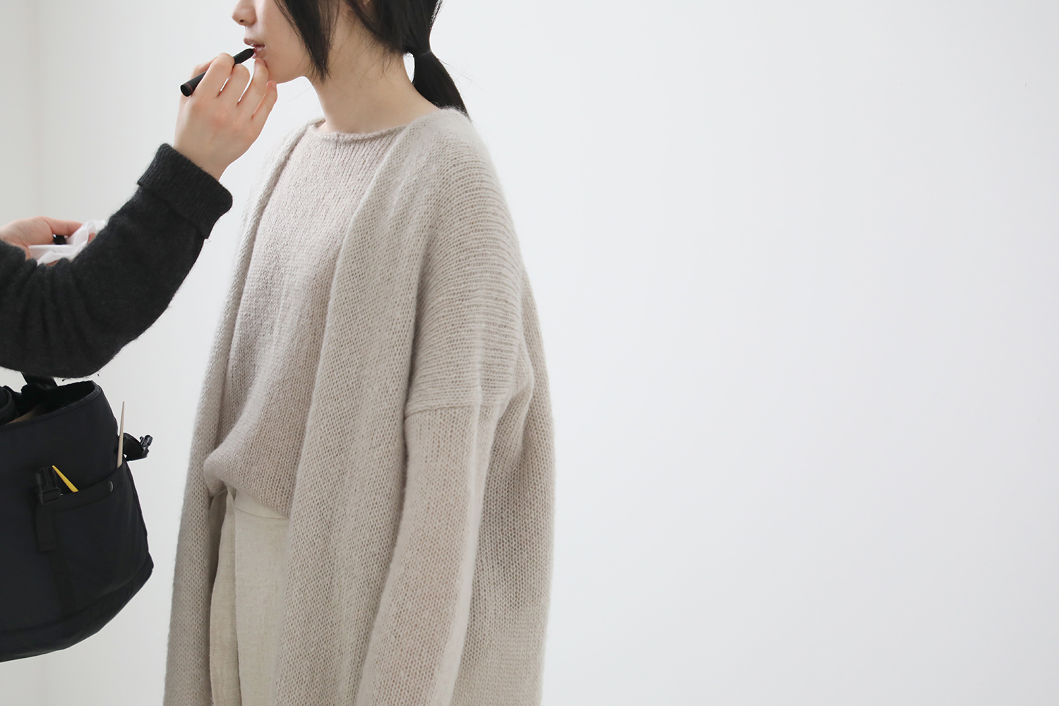
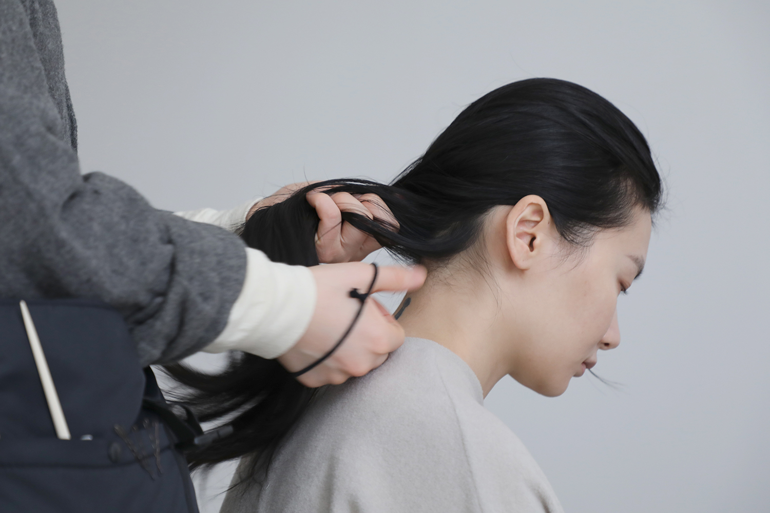
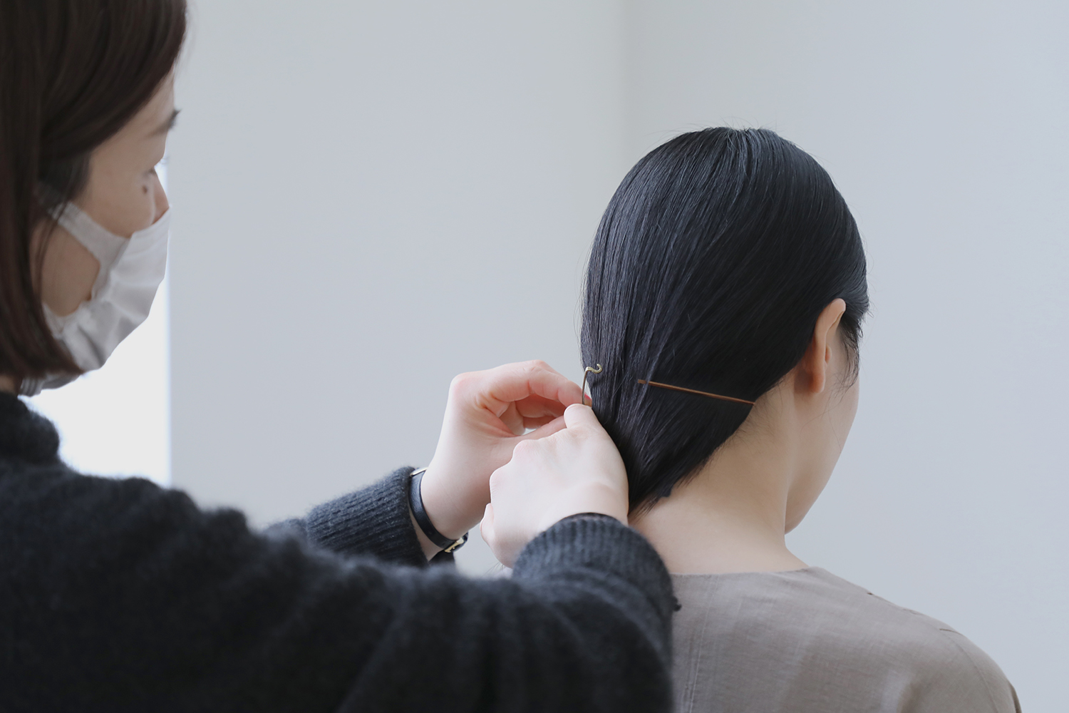
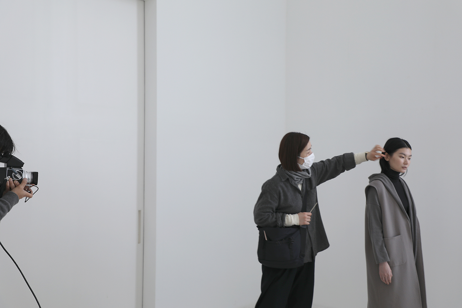
洋服をより美しく引き立たせてくれる髪型とメイク。凛とした佇まい、リラックス感のあるラフな印象など、シーズンイメージに合わせてヘアメイクを仕上げていただきます。
「evam eva が描きだす女性像を表現しながらも、モデルさんの個性を消さないように意識しています。メイクは少し付け足すだけでも印象が大きく変わります。やりすぎてしまうと、その人らしい空気感や感情までも失ってしまうような気がして。飾ることなく自然な姿そのままの美しさ、そして evam eva のお洋服の心地よさが伝わるようにヘアメイクをしています」
そうお話しいただくのは、2015年からカタログ撮影のヘアメイクを担当くださっている廣瀬瑠美さん。廣瀬さんの柔らかくあたたかな人柄でモデルさんの緊張がほぐれ、毎回撮影現場に穏やかな空気がうまれます。後から撮り直しのできない大切な時間。光のあり方、表情、スタイリング、それぞれに目を行き届かせながら撮影は進みますが、髪が乱れたときには直ぐに廣瀬さんが歩み寄り手直しをしていただける安心感が撮影をよりスムーズにしてくれます。
過度につくられた美ではなく、必要以上に手を加えずにありのままの美しさを表現することは、洋服づくりも同じ。素材それぞれの質感や風合いを決して消すことのないようにつくられたものは、その人本来の美しさに寄り添うものであるように感じます。そして、その感性を共有できているからこそ、私たちの想いが汲み取られ、より自然な姿を写しだせているのだと思います。
カメラマンは2023年春夏コレクションに続き、本多康司さん。2020年 ウェブサイト リニューアル時よりメインビジュアルの写真を担当。本多さんが写し撮る写真はどんな景色や空間であっても、やわらかな質感と静謐な空気感に包まれているように感じます。季節折々の自然豊かな山梨の写真を通して四季を感じていただけたらという想いで、暦の節目ごとに本多さんの写真をお届けしています。


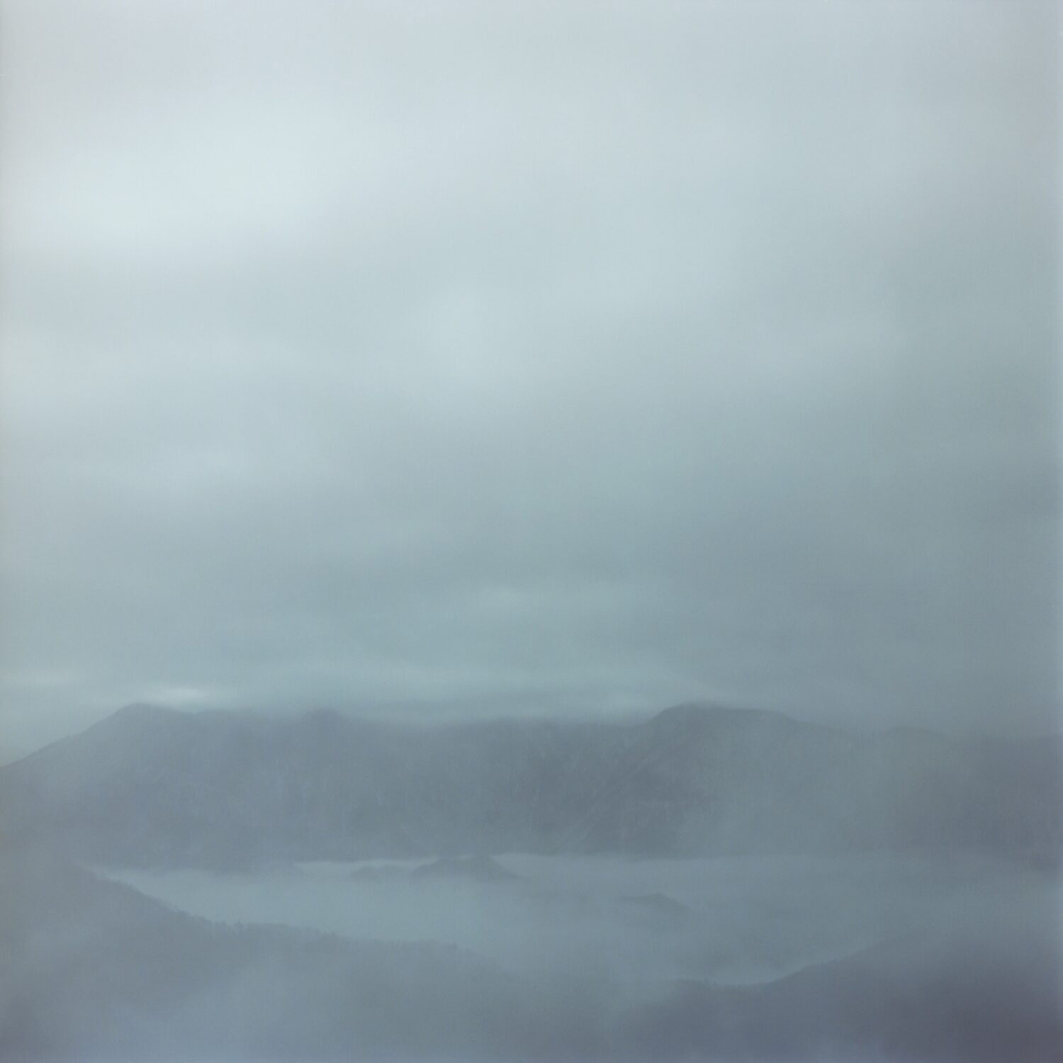
2017年山梨店にギャラリーが完成して以来、そのスペースで撮影を行っています。北側に配した窓と、大きく開く扉を開閉して、移ろう日の光に寄り添いながら進められてゆく撮影。刻々と変化する光と影と対話するかのようにシャッターを切る音がギャラリーに心地よく響きます。
「季節や天候によって光が全く違うので、あまり考えすぎないよう直感を大切に、何時でも新鮮な視点でものをみるようにしています。風景でも、人物であっても同じ感覚です。空間の中に形、光がどう存在するかを考えています」 と本多さんは話してくださいました。
一カットずつ変わるスタイリング。どの部分を大切にするか、素材感なのか纏った空気感なのか、裾のドレープ感か、細かな要素を相談しつつも、全ては写真家に任せて撮影の行方を見守ります。その場に漂う空気や感覚も透過して、静かに写し撮ってゆく時間。ファインダーの先の光景と本多さんとが静かに対話するように撮影は続きます。


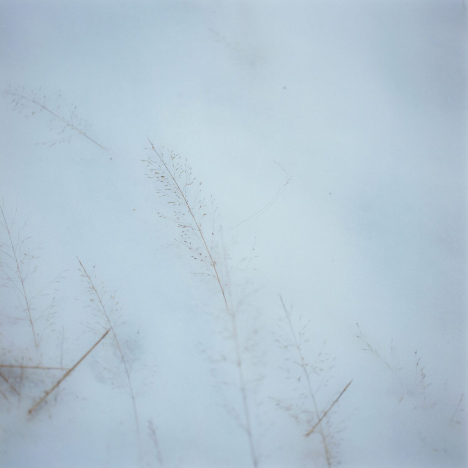
「時を経ても変わらない普遍的なうつくしさに心惹かれます。空や山、川、草木、土がゆるやかに移ろう自然の姿や暮らしに息づく人々の日常の情景が印象深く目に映ります。ただそれらの在りようのままに写し撮るようにしています。
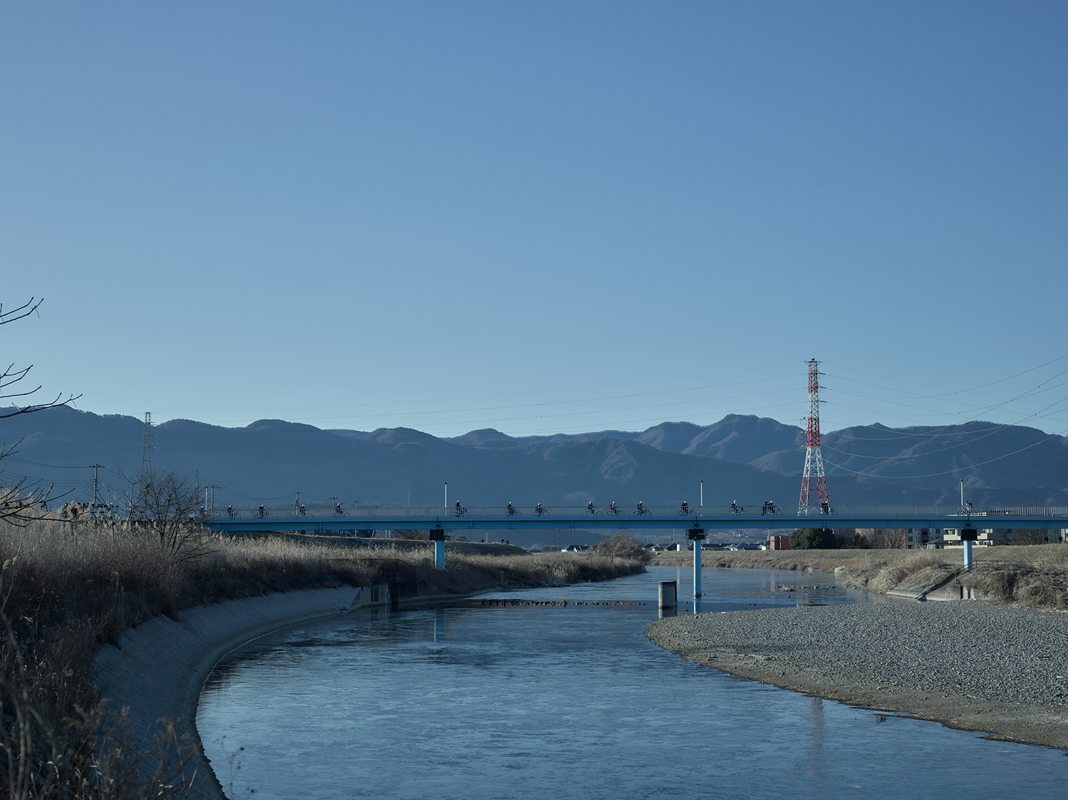
情報が多すぎる都会から離れ、自然溢れる山梨での撮影は自分にとってもとても心地よく、撮影に向かう道のりも大切な時間となっています。今朝、ギャラリーに向かう途中で見かけた土手を自転車で走る中学生の姿に思わずカメラを手にしていました。山梨を訪れて感じるこの心地よい空気までも写真に収めたいと思っています」
本多さんの写し出す世界には、誰もが通り過ぎてきた日々の暮らしの中で忘れてしまった心の記憶に想いを馳せるきっかけを与えてくれるようです。

2018年よりカタログ制作を担当してくださっているのは、長野県松本市に本社を構える創業68年の藤原印刷株式会社。出版印刷や商業印刷に加え、さまざまなクリエイターの書籍や写真集など色も形も多様な印刷物の企画・製造・造本設計を手掛けられています。
カタログ制作をご一緒するのは、今回で8回目となります。紙・印刷・製本・加工の提案、スケジュール管理を担当くださっている小池潤さん。evam eva のカタログ制作で大切にされていることを伺いました。
「コミュニケーションがすごく大切だと思っています。自分を介して伝えた方がよい情報と、介さずに全員と交えて話した方がよい場合があって。言語化できない空気感や温度感みたいなものも一緒に感じられるようなコミュニケーションを取り合うことで、情報の質を高められると考えています。可能な限り直接お会いして、同じものを見てお話することが出来れば一番良いのですが、それが叶わなかったとしても、今はオンラインというツールを活かして同じ時間と熱量を共有するよう意識しています。
evam eva というブランドは、まっすぐ芯が通っているように感じます。そこが私たちにとっての旗印にもなっており、それをまさに体現しているのが evam eva yamanashi だと思います。あの場の空気を共に感じることができたことは本当に有意義な出来事でした。いつもあの空気感を感じながら制作に取り組むことができています」
これまでにも、ニットの編地を紙に象りたい、生地を表紙に貼り付けたいなど、過去に事例のない仕様だとしても、どうしたら実現できるのか、いつも丁寧にヒアリングしてくださる小池さん。此方に寄り添いながら、さまざまなご提案をしてくださり、安心してお任せしています。
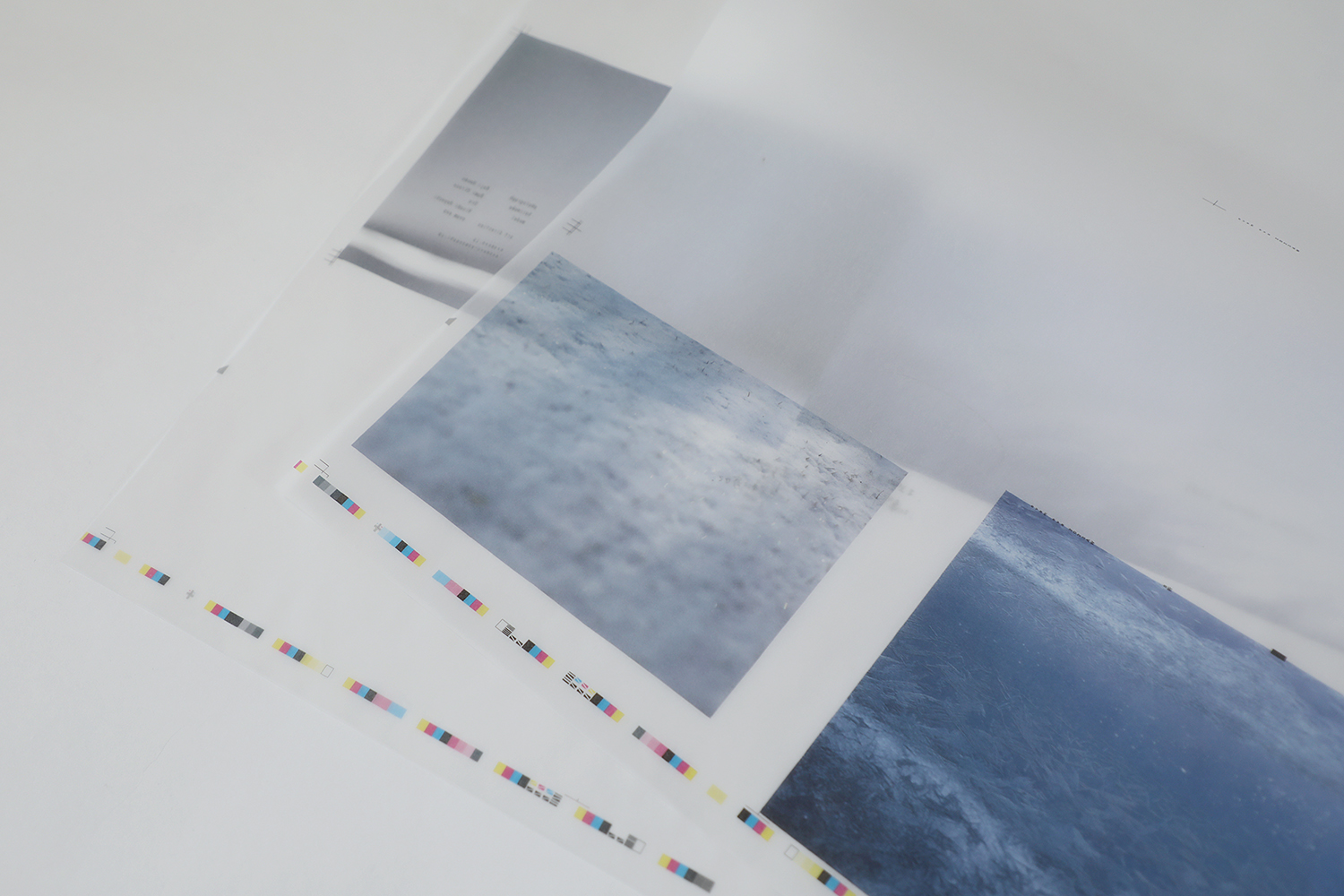
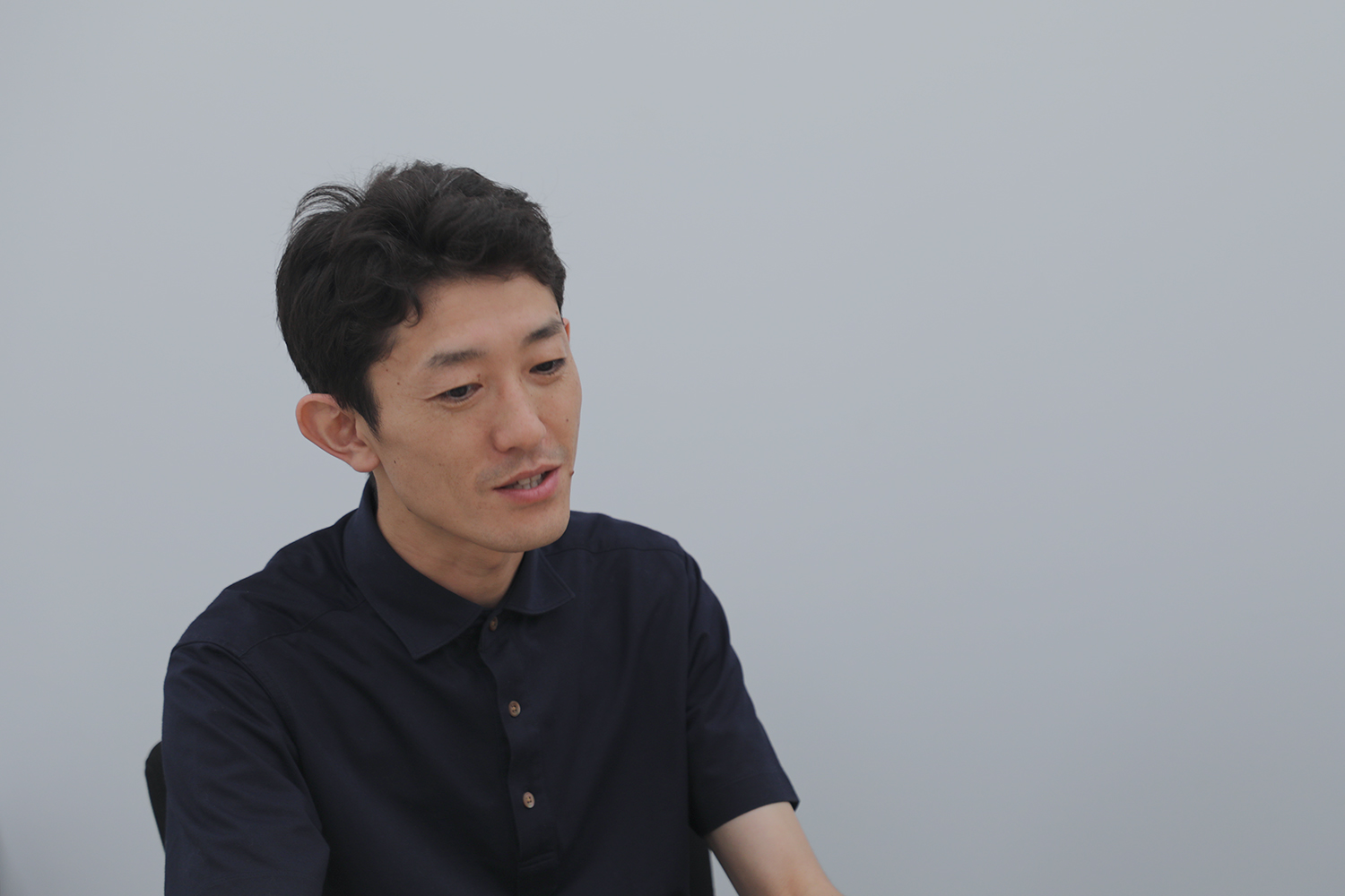
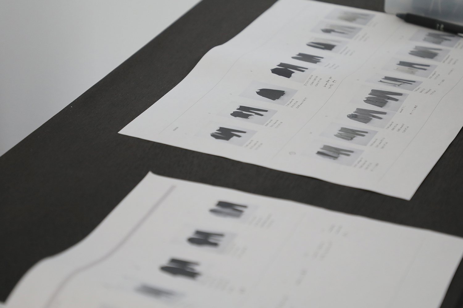
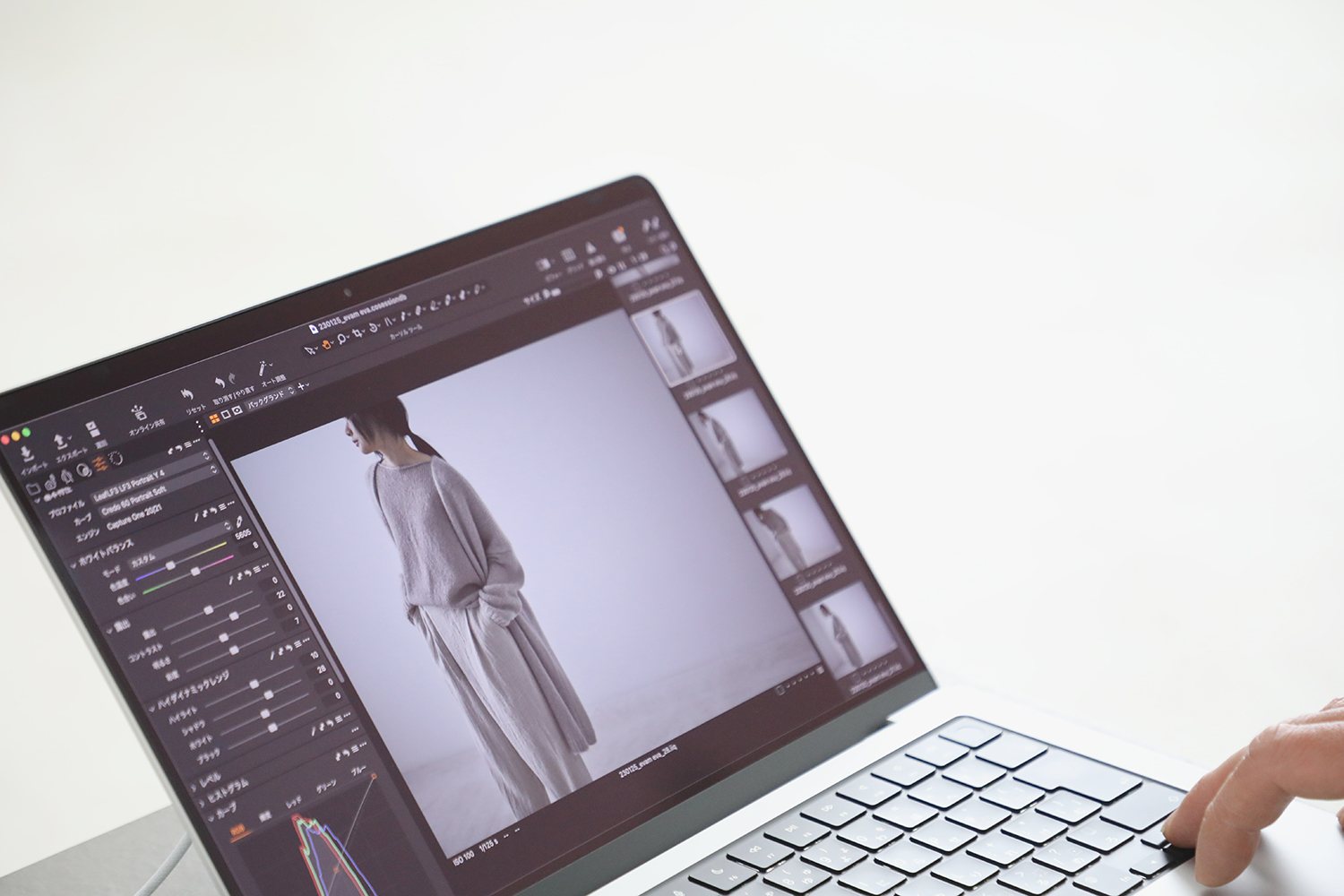
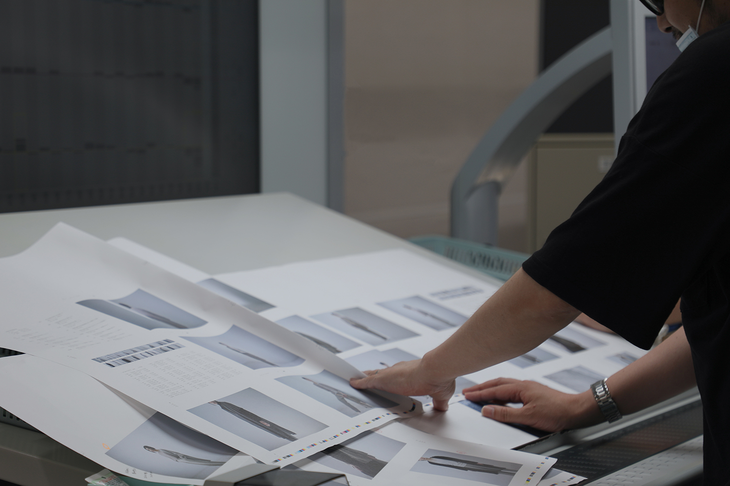
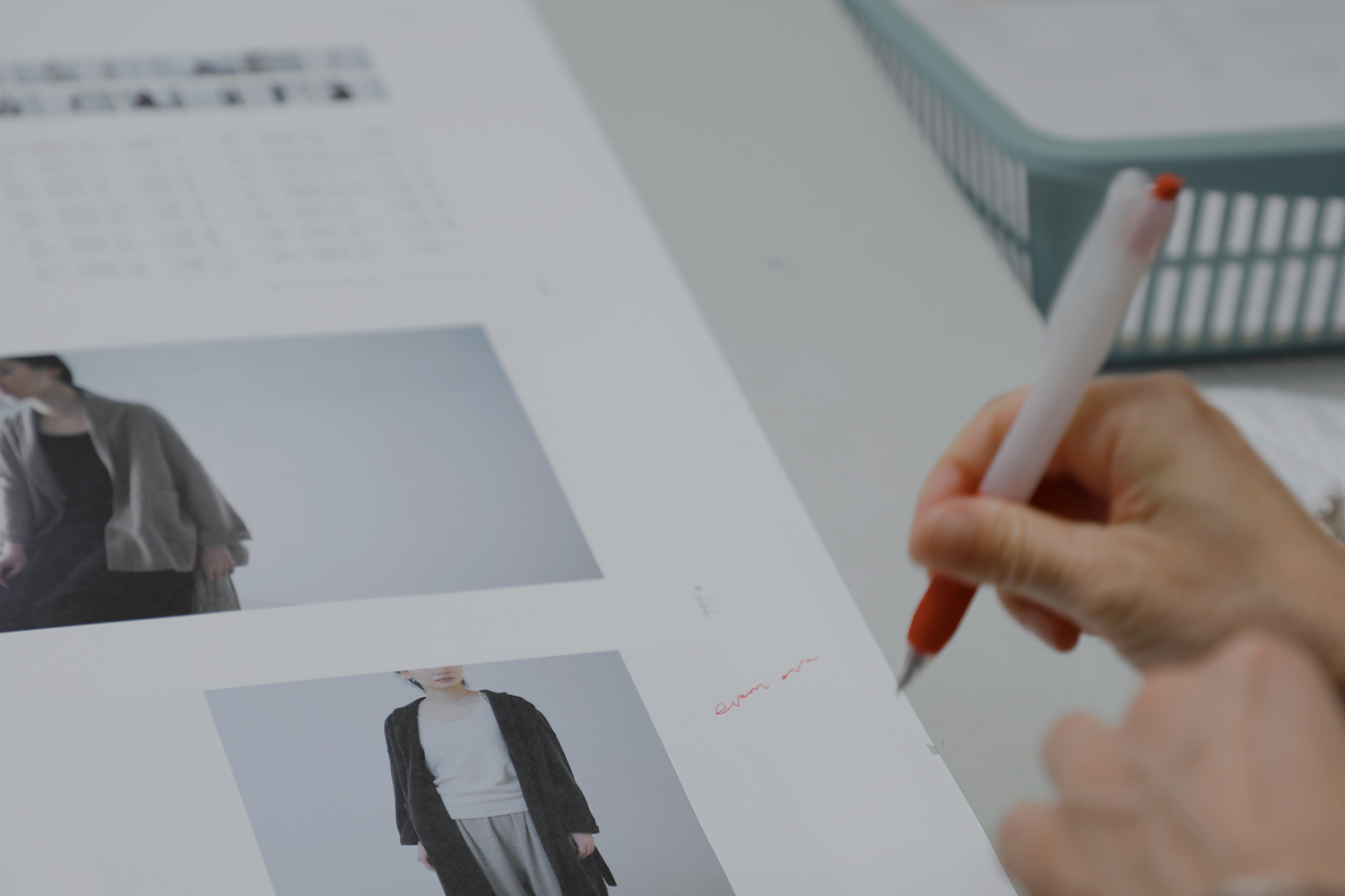
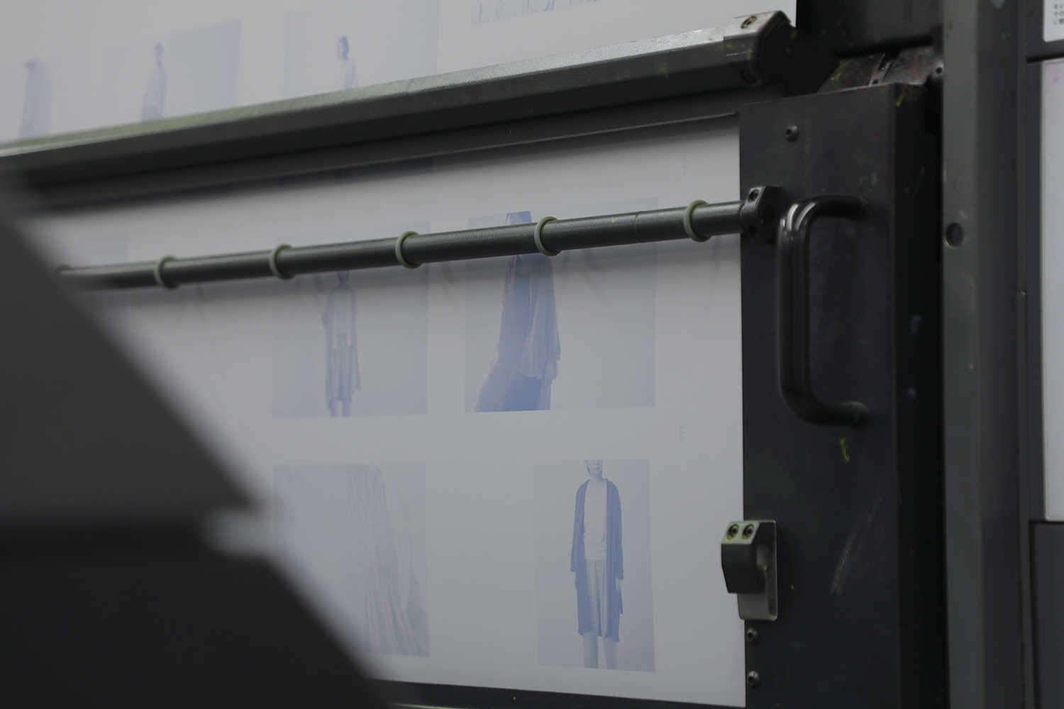
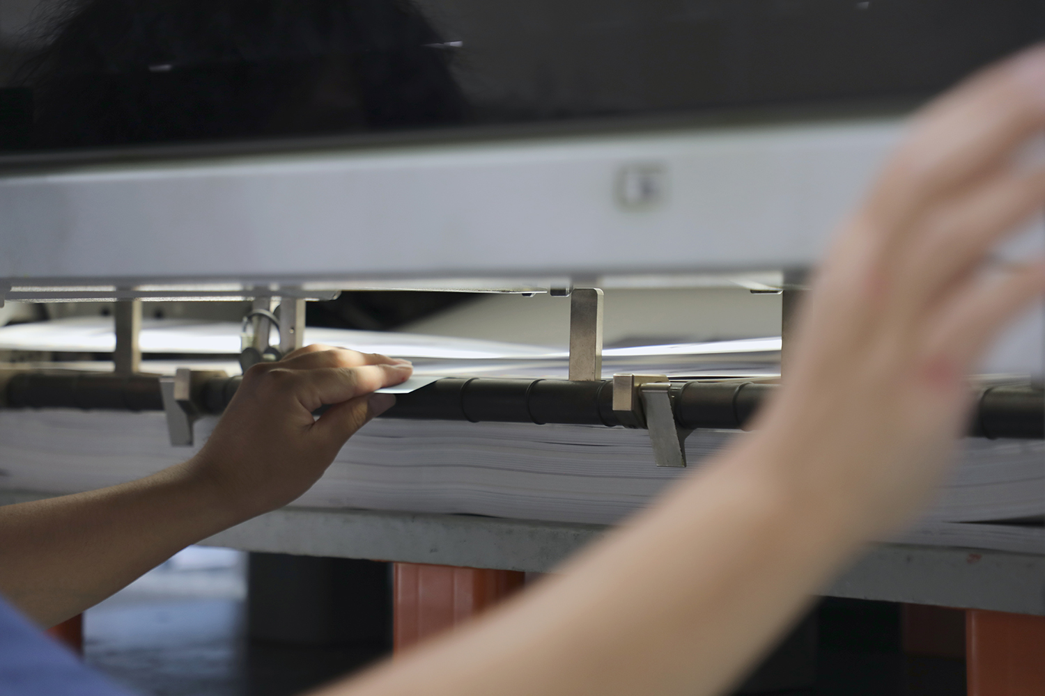
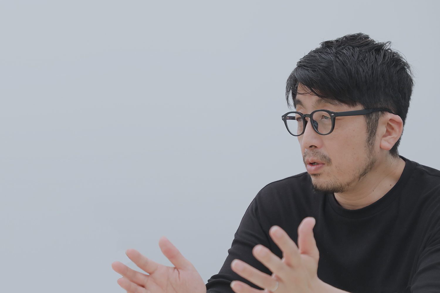
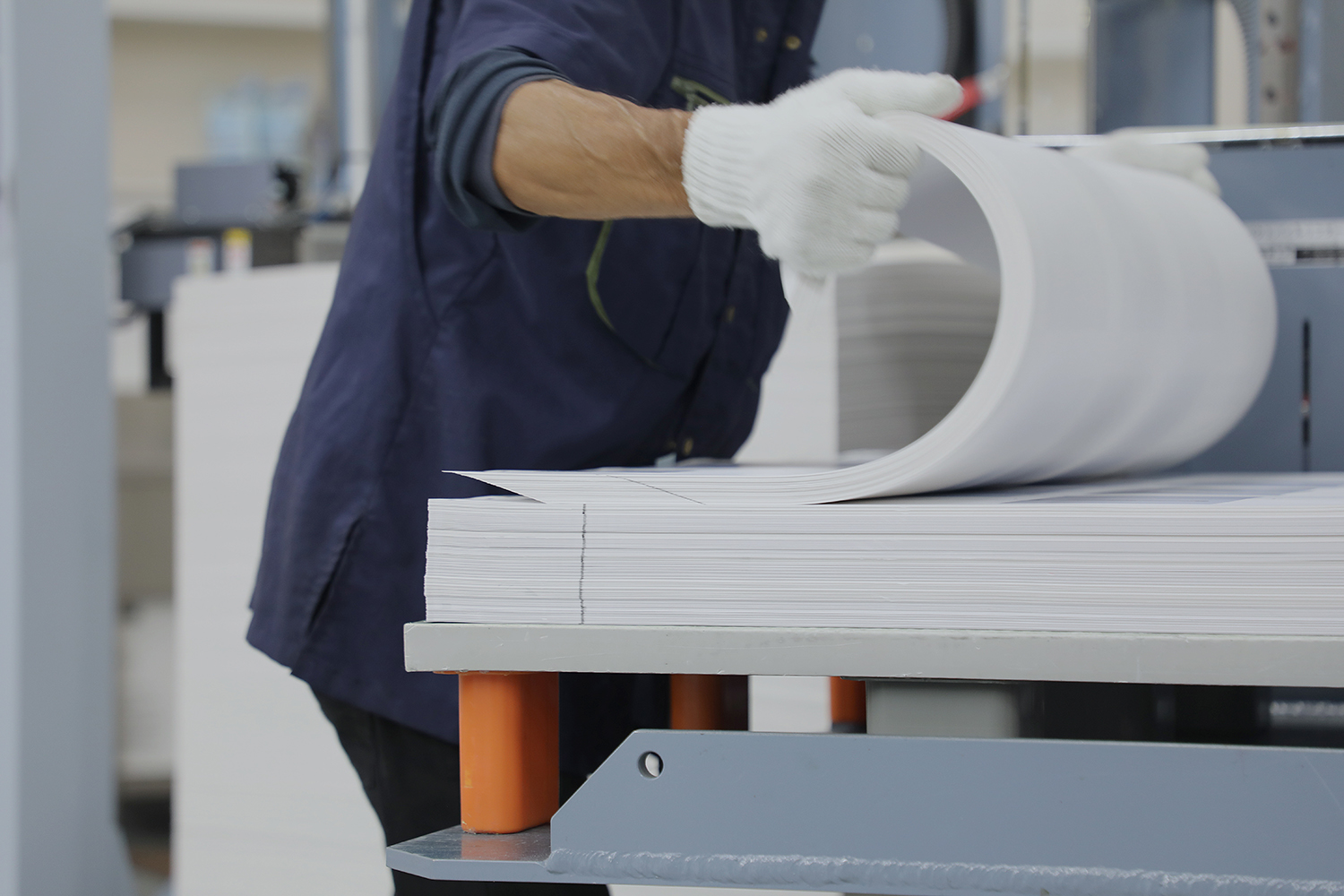
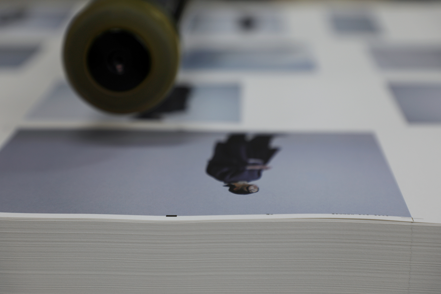
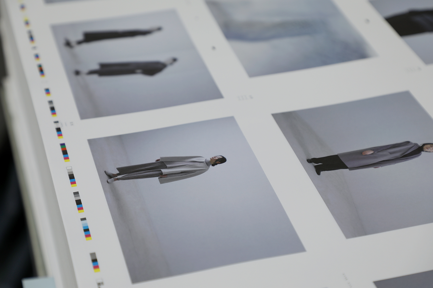
この日は、本刷り前の印刷立ち合いの現場へ伺いました。1ページごとに印刷機で刷り上がった最初の一枚を見て、最終的な仕上がりを確認し、その後、本刷りとなります。写真の仕上がりや色の調整など印刷工程全てをディレクションしてくださるのがプリンティングディレクターの花岡秀明さん。今回のカタログ写真は青みのあるグレートーンの世界観。グレーという色は、紙での再現性を保つのがとても難しいため、細心の注意を払って作業しているとお話しくださいました。
「印刷する紙によっても色の出方は大きく変わります。今回選ばれた質感のある紙は色が転びやすいため、ドイツのハイデルベルグ社が製造しているUV印刷機で印刷しています。この印刷機は、紙が出てくる直前に紫外線(UV)を照射することで紙にインクが浸透する前に硬化し、刷り終えた紙が重なってもインクが写ったり、擦れたりすることがほぼありません。手触り感のある紙だと、紙にインクが浸透する前に固まるので、色が沈まず、発色が保たれます」
使用する紙もシーズンに合わせて細やかに変えています。春夏は、ぱらぱらっと手から移ろうしなやかな紙を。秋冬は手触りがあって、温もりを感じる色合いのものを。服をつくるときと同じように、手にしたときの風合いや触れる質感にイメージを重ねていきます。
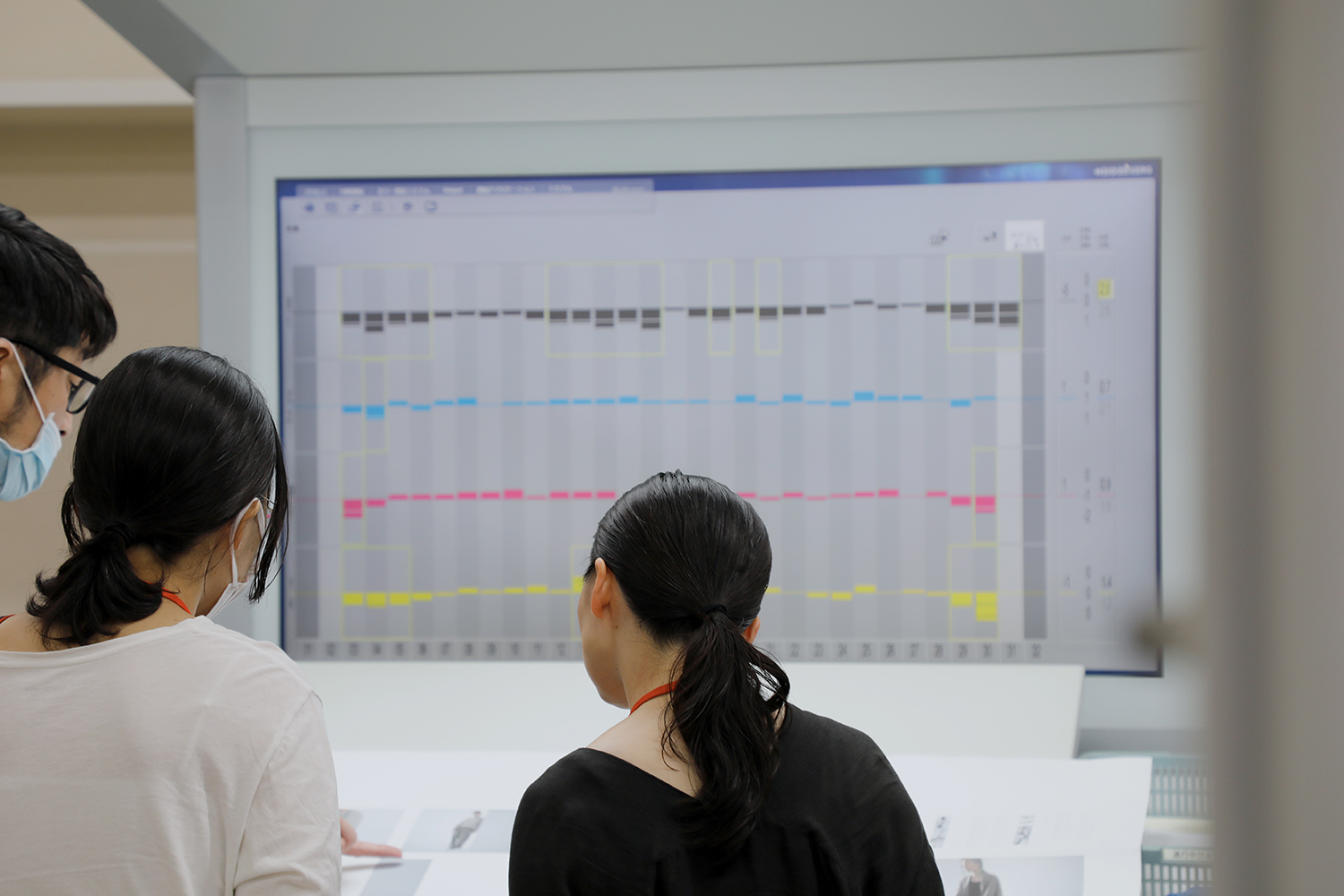
「印刷では服本来の色味や質感を正確に表現することも大事なんですが、それ以上にニュアンスがとても大切な要素となります。自然光で写しだされた衣服やモデルの佇まい。撮影された季節や時間帯、場所によって異なる光の陰影。一枚一枚の写真の世界観をそのまま紙に落としこむために、色を読みながら、1パーセント単位で画像を補正し、整えていきます。
赤い青いとか、強い弱いとか言葉では感じ得られないニュアンスを拾うため、evam eva の担当になった最初の頃に evam eva yamanashi へ伺いました。お店に並ぶ洋服、広がる空間、そこで働く方々の姿を自分の目で直接拝見することができました。この経験があったからこそ、ブランドが大切にされているニュアンスを汲みとりながら作業することができるのだと感じています」
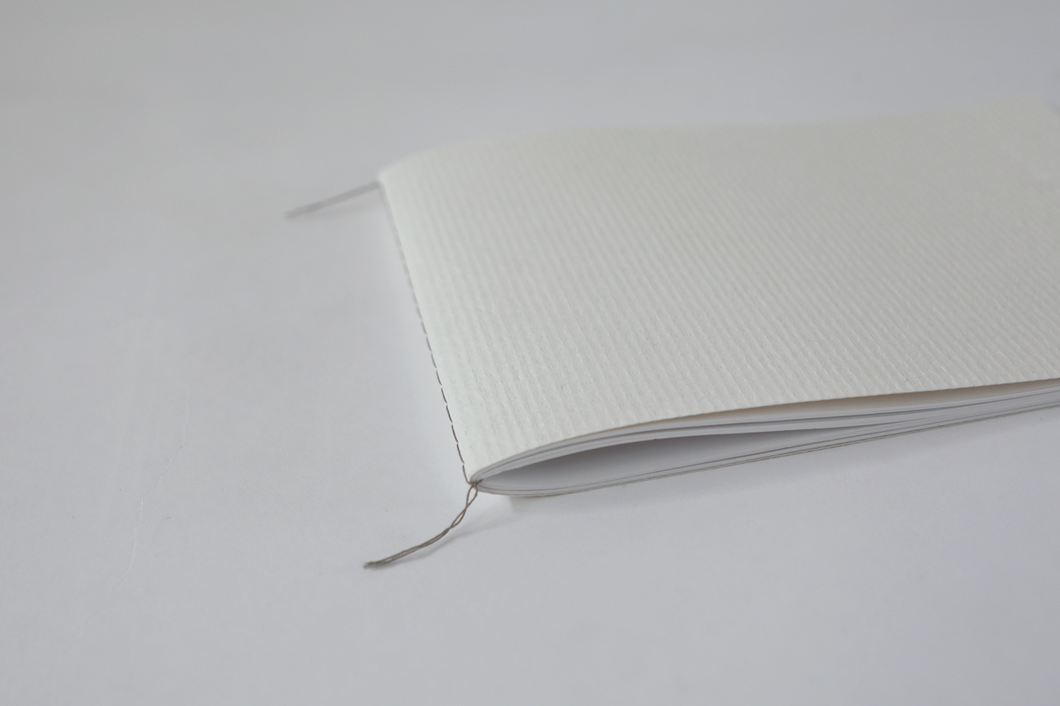
色の表現の仕方は人それぞれ。感覚的なものであるがゆえに、紙に写しだされた色合いを言葉で伝えるのは複雑で難しいものです。それでも花岡さんは、完全に言語化できないふわりと漂う空気感、こうありたいという此方の想いまで忠実に表現してくださいます。紙でしか表すことができない色、紙だからこそ伝えられるニュアンスを大切にされていると感じました。それぞれの想いと丁寧な仕事を経て、製本され、カタログは出来上がります。
言葉とその間合いの感覚や感情の断片を重ね合い共感しあうものづくり。服もまた着る人の暮らしと繋がり、その人の記憶となって共に過ごしていくもの。山梨の自然から多くのインスピレーションを受けて、evam eva の服が生まれ、その背景にある景色や心地よさと共に、人に寄り添うものでありたいと思います。
お届けは8月頃。
頁をめくりながら、一足先の季節を感じてみてください。
photographer:本多康司
*写真12枚目から14枚目, 34枚目
column|collection catalogue
evam eva’s clothes continue to be made with the passage of time and the state of mind at that time as the collection theme. The inspiration for this comes from everyday life. Casual everyday scenes, someone’s words, or a distant memory of a certain time. The designs are created by connecting these elements and reflecting them in materials, colours, silhouettes and details. The collection catalogue is designed to express the world view that drifts through the mind. In this column, we talk to some of the people involved in the production of the evam eva catalogue and introduce the process of creating the catalogue.
Seasonal catalogue for the changing seasons. The colours are as important to evam eva’s worldview as the choice of materials. We decide on seasonal colours and create colours while imagining the beautiful shades found in nature, the feelings of the moment and the way we want to be. Even if dyed in the same colour, a slight difference in shade is produced when the material is changed. The fluctuations in colour create shades when the garment is worn as clothing, creating a natural colour and texture.
The silhouette of the collar, sleeves and hem, the shape of the drape, the balance of the overlapping colours, and other fine nuances are all carefully adjusted to the wearer’s body and posing during the shoot to ensure the evam eva style is present in every detail.
‘We are conscious of not erasing the individuality of the models while expressing the image of women that evam eva portrays. Even a small addition of make-up can make a big difference to the impression. I feel that if you overdo it, you lose the atmosphere and emotions that are unique to that person. I do hair and make-up so that the beauty of the person’s natural appearance and the comfort of evam eva’s clothes can be conveyed.’
Rumi Hirose, who has been in charge of hair and make-up for catalogue shoots since 2015, explains. It’s an important time when you can’t reshoot afterwards. The shoot proceeds with an eye on the light, facial expressions and styling, but the peace of mind that comes with knowing that Ms Hirose will immediately step in to fix any messy hair makes the shoot go even smoother.
The same applies to the production of clothing, where beauty is expressed as it is, not as excessively created, but without adding more than is necessary. We feel that clothes made in such a way that the texture and feel of each material is never erased are something that accompanies a person’s natural beauty. And it is precisely because we share this sensitivity that we are able to capture our thoughts and feelings and capture a more natural appearance.
The photographer is Koji Honda, who has been shooting in the gallery space at the Yamanashi shop since it was completed in 2017, following on from the 2023 spring/summer collection. The shoot is carried out by opening and closing the windows and wide-opening doors on the north side of the building, while leaning in close to the shifting daylight. The sound of the shutter clicking resonates comfortably in the gallery, as if in dialogue with the ever-changing light and shadows.
‘The light is completely different depending on the season and the weather, so I try not to think too much and always look at things from a fresh perspective, valuing intuition. It’s the same for landscapes and people. I think about how shapes and light exist in a space,’ says Mr.Honda.
The time spent quietly capturing and photographing the air and sensations that permeate the scene. The shooting continues as if Mr.Honda and the scene beyond the viewfinder are having a quiet dialogue.
‘I am fascinated by the universal beauty that has remained unchanged over time. I am deeply impressed by the natural landscape of the sky, mountains, rivers, grass, trees and soil as they gently change, and by the everyday scenes of people’s lives. I try to capture them just as they are.
I feel very comfortable shooting in Yamanashi, a place full of nature, away from the city with too much information, and the journey to the shoot is also an important time for me. This morning, on my way to the gallery, I saw a junior high school student cycling along the bank, and I couldn’t help but grab my camera. I want to capture even this pleasant air I feel when I visit Yamanashi in my photographs.’
The world that Mr.Honda captures seems to give us the opportunity to recall the memories of the heart that we have forgotten in our daily lives that we have all passed through.
The company responsible for catalogue production since 2018 is Fujiwara Printing, a 68-year-old company with headquarters in Matsumoto, Nagano Prefecture. In addition to publication printing and commercial printing, the company is involved in the planning, production and bookbinding design of a wide variety of printed materials in both colour and shape, including books and photo collections by various creators.
We asked Jun Koike, who is in charge of paper, printing, binding, processing proposals and schedule management, what is important to him in the production of evam eva’s catalogue.
‘I think communication is very important. There are cases where it is better to convey information through me and cases where it is better to talk with everyone without using me. I believe that the quality of information can be improved by communicating with each other in such a way that you can feel the atmosphere and temperature together, which cannot be verbalised.
The brand evam eva seems to have a straight core. That is also our banner, and I think evam eva yamanashi embodies that. It was really meaningful for us to be able to feel that atmosphere together. I always feel that atmosphere as I work on my creations.’
Mr.Koike always listens carefully to us to find out how we can realise the specifications, even if there have been no examples in the past. He makes various proposals while staying close to us, and we can leave our work to him with peace of mind.
On this day, we visited the site where the printing process is carried out prior to the actual printing. Printing director Hideaki Hanaoka directs the entire printing process, including the finishing of the photographs and colour adjustments. The photographs in this catalogue have a bluish-grey tone to them. He told us that grey is a very difficult colour to reproduce on paper, so he works with great care.
‘The way the colours come out varies greatly depending on the paper on which they are printed. The textured paper chosen for this project is prone to colour rolls, so we print on a UV printing machine manufactured by Heidelberg in Germany. With textured paper, the ink hardens before it penetrates the paper, so the colours don’t sink in and are preserved.’
The paper used is also changed in detail according to the season. Just like when we make clothes, we create an image of the texture and feel of the product when you hold it in your hand.
‘In printing, it’s important to accurately represent the original colour and texture of the garment, but nuance is a much more important factor. The appearance of clothes and models captured in natural light. The shades of light that vary depending on the season, time of day and location where the photo was taken. In order to capture the world of each photograph as it is on paper, the colours are read and the image is corrected and adjusted in one-per-cent increments.
I visited evam eva yamanashi when I first started working together with evam eva in order to pick up on nuances that words cannot capture, such as red and blue or strong and weak colours. I was able to see with my own eyes the clothes lined up in the shop, the space that spreads out, and the people who work there. I feel that it was because of this experience that I was able to work with the nuances that the brand values.’
People have different ways of describing colour. Being sensory, it is complicated and difficult to convey in words the shades of the colours on paper. Even so, Mr.Hanaoka faithfully expresses the softly drifting atmosphere that cannot be completely verbalised, and even our desire to be this way. I felt that he values the colours that can only be expressed on paper, and the nuances that can only be conveyed on paper. After each thought and careful work, the catalogue is bound and finished.
The creation that overlaps and sympathizes with words and fragments of sensations and emotions in between. Clothes are also connected to the wearer’s life and become a memory of the person who wears them and spends time with them. The clothes of evam eva are inspired by the nature of Yamanashi, and we want them to accompany people with the scenery and comfort in the background.